Here are some annotated examples of what some of the larger and better-known Japanese e-commerce sites do with the registration forms. They illustrate common practice in terms of field choice, layout and naming of elements.
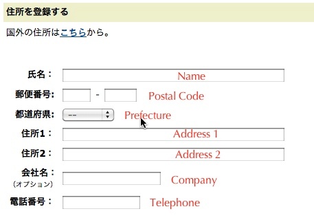
Amazon keeps things short and simple with their no-frills, minimal address form.

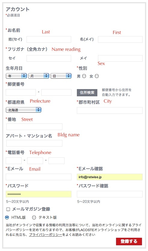
The Lacoste registration page packs a lot into a small area. A handle postal code-based address lookup function saves and keystrokes.

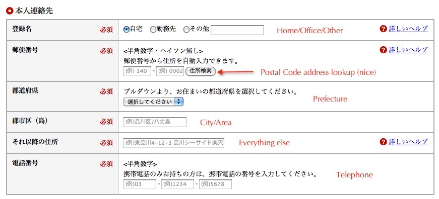
This only the address portion of a much longer form on Rakuten’s registration page. All form elements are pre-filled with dimmed example text which clears on focus.
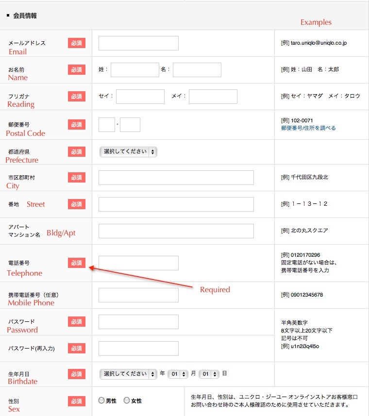
Perhaps the best-looking and well-designed of the bunch is Uniqlo’s registration form. Example text is placed out of the way to the right, required fields are clearly marked, and the design is clean and minimal. All that’s missing is an address lookup function.


