Apparel and fashion e-commerce websites take great care to get their content elements just right, from product presentation and branding to related products and other cross-selling opportunities. Yet one important piece of content often gets less attention, and this oversight can have a direct negative impact on conversions.
Size charts and fitting guides. In the online apparel shopping experience they’re indispensable, and the closest thing to a fitting room you’re able to offer your visitors. Nothing else in your website has a closer, more direct relationship with customer satisfaction (my new clothes fit well, or don’t), repeat business (I can trust the accuracy of the size chart, or not), and even operations (as they relate to “exception” handling of things like fit-related returns, refunds, and exchanges).
You would think that something so important for sales and satisfaction would be treated as a top priority, on par perhaps with the layout of the product details page or product search results, but but often this is not the case.
One reason for this may be that no standard format for presenting size and fitting details exists. Designers come up with whatever layout and design they think works best, often in isolation and with mixed results. Meanwhile, website visitors need to learn a new information architecture for this data for each new website they visit.
To illustrate this, let’s take a look at a few Japanese apparel and fashion EC websites and see how they approach the problem of size and fitting charts.
Speedo
The Speedo website size guide suffers from a common problem: trying to cram everything into a single page.
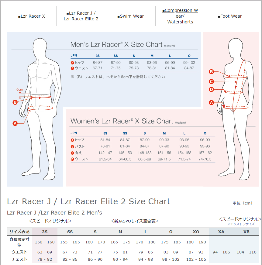
The screenshot above includes only around half of the total page content. You can click here to see the whole thing. On a PC it’s a prodigious amount of content to include in a single page, but at least it’s readable.
On a smartphone, however, the experience is less enjoyable. The text in the non-mobile-optimized page just gets scrunched down to sub-atomic dimensions, requiring the user to pinch, zoom, and drag like mad to home in on the particular dimensions they seek.
Tabs across the top provide access to the various product categories, but give no indication of which section is currently being viewed.
Gender-based color-coding of the main sections and clear measurement specs are helpful, but overall they are just trying to fit way too much into a single page. Smaller, category-specific size guides that are mobile-friendly would be a big improvement here.
Wacoal
Underwear-maker Wacoal is the dominant player in the lingerie space here in Japan, but that doesn’t mean they wrote the book on effective UX design. I say that because their approach to conveying size information is typical of the websites that try to stuff too much information into too small an area.
Consider this mobile view of their Size Guide:
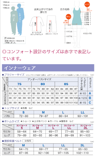
Can you imagine how many spread-and-drag operations are involved in finding your size? While this kind of information density and layout might for work for someone on a PC with time to kill, the mobile experience leaves much to be desired. With more than 60% of EC website traffic (and often more) coming via smartphone, this is not an approach we can take if we hope to deliver a positive shopping experience which customers will be happy to repeat.
Here are some other examples of this kind of presentation style:
LACOSTE
This mobile-optimized measurements table is more readable than many, but the measurement guide below is basically just the PC version made smaller.
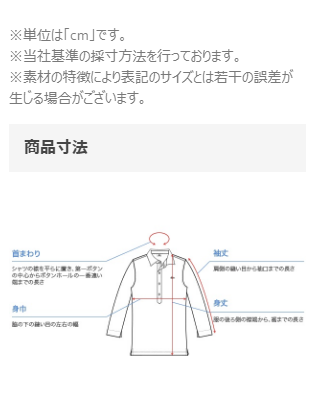
Funkier
The size chart page for Funkier Bike is responsive but the image is not, making it impossible to read the content without zooming. Moreover, users will find it this chart difficult to understand for another reason as well: the content is in English. Completely so.
To be fair, users could zoom way in and see that A is for the chest area and work things out that way, but why make them work so hard? This is what happens when the question of how to help visitors find their size is considered merely as an afterthought.
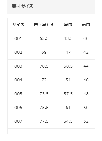
INKnBURN
We see a familiar pattern repeated here: loads of content but not at all optimized for mobile. Even after zooming in the content is so blurry as to be almost impossible to read.
They provide measurements for chest and sleeve length, but don’t provide any indication of where to measure the chest.
I like the inclusion of the “customer-voice”-type content, but wonder how useful this is for those of us who (like me) cannot identify closely with one of the four examples provided.
H&M
I like how H&M handles the information density problem. First, there is no “size guide” option visible in the product details page. You see it only when you click on the size chooser, indicated below.
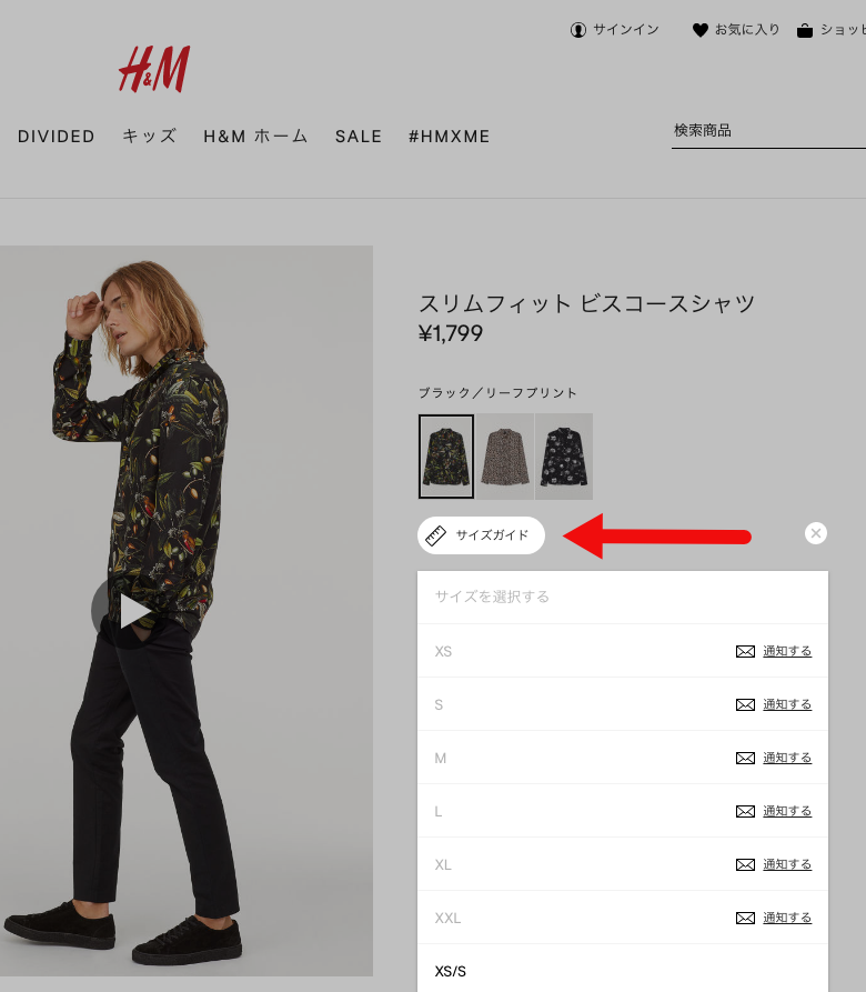
When you click on it, a side-docked size guide appears (see below). They use an accordion function to conserve space, and the user need only scroll down to the section she is looking for size details on and click/tap to open it up. On smartphones it fills the screen and is easy to read and use,
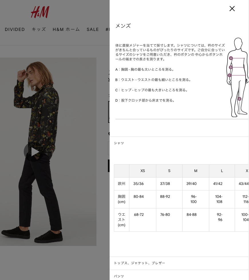
The only thing they could do better here would be to have the content fit completely in the sidebar modal window. It’s around 30 pixels too wide at the moment, which means you have to scroll slightly horizontally in order to see the rightmost table columns or (on mobile) the figure with the measurement guidelines. A slight adjustment in the layout of the content would easily fix this, leading one to wonder why no one has.
ZARA
ZARA got it right. Let’s start with the product details page. First, they tell you the height of the model and size of the clothes he is wearing. ZOZOTOWN also does this, and I think it’s a great idea. All apparel websites should do this.
The “size info” link isn’t tucked away in some dark corner like a drunken uncle at Easter dinner, but is prominently displayed exactly where it should be: right next to the buy button!
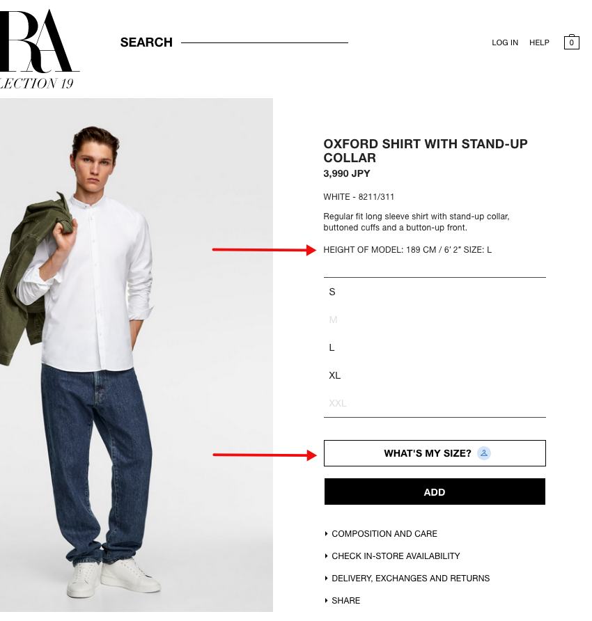
Clicking What’s My Size produces a pop-up window like the one below. (Yes, we’re using the Japanese version here, though the English version of the website has one in English, as you would expect.)
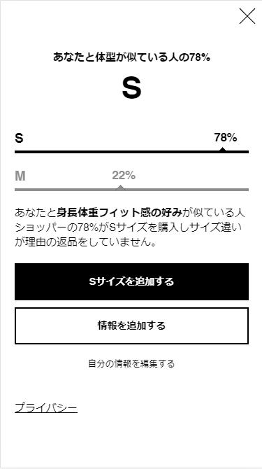
What they do here is elegantly simple. Type in your height and weight, as well as your preferred “fit” if you like, and the site will recommend a size for you based on product return data.
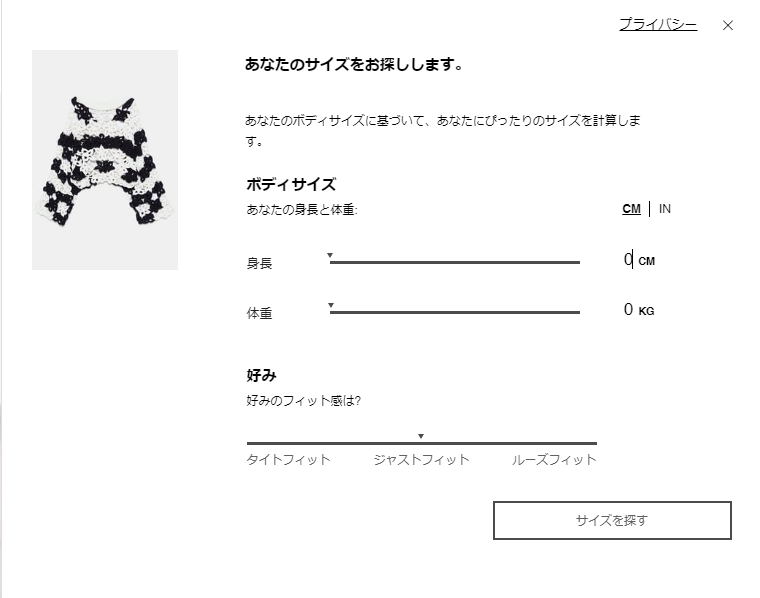
In the example below, 78% of customers with your approximate dimensions kept their S-sized products after ordering them. Pretty cool, eh?
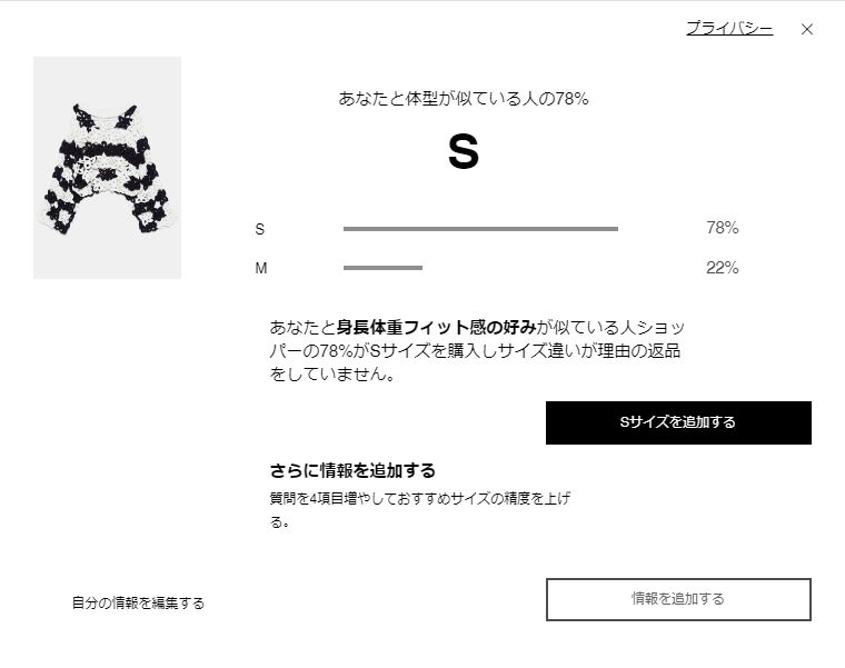
You can optionally add other information as well, such as pudginess (or whatever that is below), body shape, and age. After making your selections the system will remember your size and pre-select it as you subsequently go about browsing products.
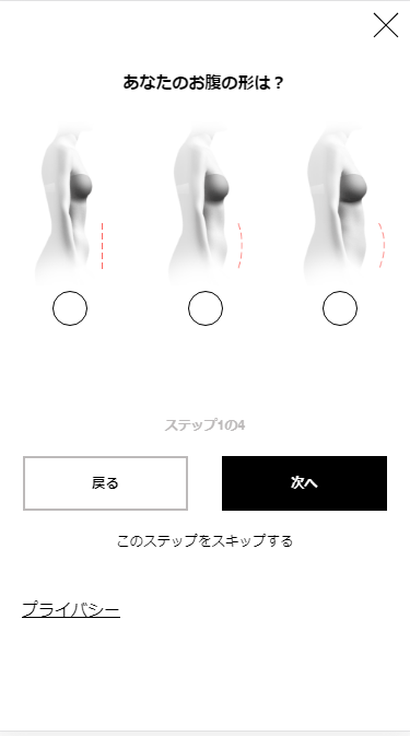
The mobile experience is essentially the same, and very well-implemented and mobile-friendly.
I’m not a fan of casually deploying interactive elements that require user input (and thus add friction) into what could otherwise be a very smooth and speedy shopping experience, but in this case I’ve gotta say: this works.
When you consider that the alternative is having to wrap your head around a complicated table of figures you’re likely seeing for the first time and constantly cross-reference what you see there with measurement guides (and sometimes even unit conversion tables), you can see that the difference in both cognitive load and time-to-complete is significant. It’s “here’s your size” rather than “go ahead, try and find your size.” Nice job, ZARA!
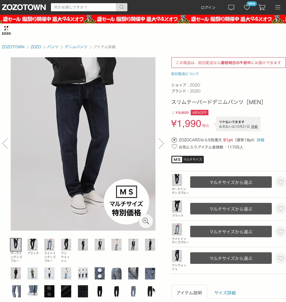
ZOZOTOWN
One would expect Japan’s leading online fashion and apparel marketplace to get this kind of thing right, and I can tell you we were not disappointed.
ZOZOTOWN has two kinds of size guides. The first is a typical table, though within it they don’t try to do too much. It fits in the sidebar at desktop widths, and takes the full width of the screen when being viewed on a smartphone. The innovative thing they have done here is to make the table horizontally scrollable with a frozen left column. Here is what it looks like:
It looks and works the same on mobile. Further down in the page is a “size guide” link which opens a popup window with the measurement guidelines, each large and easy to read.
The other size guide is for their impressive multi-size product lineup and associated size chooser. After analyzing body type and size data for over a million customers, ZOZOTOWN has collaborated with apparel makers to develop products that are available in literally dozens of sizes.
When shopping for multi-size products you simply enter your height and weight, and the system takes it from there. They’ve also managed to make it look very slick and professional, as you can see below.
Like ZARA, this is another great example of giving shoppers the information they need without making them think one little bit.. Could this be the future? My guess is yes, but for now let’s return to the present.
Now that we’ve had a chance to see how various websites approach the design of their size and fitting guides, let’s distill what we’ve learned into a simple checklist you can refer to when creating your own website size and fitting chart.
Website Size Chart Best Practices
- Use a responsive content layout, and make sure it also allows for zooming on mobile devices.
- Consider programmatic options which provide users with size recommendations dynamically based on user input.
- Use simple, large images for the measurement guidelines, and indicate measurement areas clearly and unambiguously.
- Do not try to include too much information into too small a space. Make judicious use of accordions, tabs, or other space-saving UI devices to handle dense information.
- Choose text sizes which are easy to read across all device types.
- Position and style links to the size guide in a way that makes them very easy to find.
- When presenting Imperial or other nonCarefully consider your audience and use of size units to ensure non-Japanese units can be easily converted or mapped by the user.
- When using images with models, always indicate what size(s) the model is wearing, along with the model’s height.
- Tables should be simple and lightweight. When you have a lot of data to present, it is better to create additional simple tables than to stuff everything into a single large and complex one.
- When confronted with table width constraints, such as on mobile devices, you can employ horizontal scrolling along with “frozen” header rows and/or columns that remain in place as the user scrolls.
Have any tips you’d like to add? Leave them in the comments! I’ll be happy to update this article to include any pointers that could be of use to eCommerce web design companies or anyone else interested in improving the user experience and conversion rate of their own online store.